

Stubhub - Mobile 2019
Stubhub Seatmaps: The Rescue Mission
Simplifying a complex ticket-buying experience under tight deadlines

Stubhub’s Challenge
StubHub's event page drove $15M in daily GMS — and it was broken. A 47% bounce rate. 2.5% conversion. Users couldn't make sense of the seatmap, couldn't compare options, and were leaving before buying.
"The layout is too overwhelming, too many information for me to digest." — StubHub user
The design team had tried to fix it once already. That attempt failed. I inherited the stalled project.
My Role
I inherited a project that had already stalled once. A previous framework had been abandoned, stakeholders had conflicting opinions, and the timeline was tight. My job wasn't just to design a better seatmap, it was to get a team that had lost confidence aligned around something shippable.
Key Decisions
From Drawer to Split-Screen: Backed by Data, Not Opinion
Stakeholders wanted a drawer layout, map on top, listings sliding up from the bottom, inspired by Yelp. Research showed users needed to see both simultaneously to compare options. We ran usability testing that proved toggling between views created friction and broke confidence mid-decision. Split-screen won. Not because I said so, but because users showed us.
The redesign focused on making the seatmap clearer, faster, and more trustworthy, helping users understand value at a glance and make confident purchase decisions.

Filtering Before the Seatmap
Instead of dropping users into an overwhelming grid of options, we introduced a full-screen filtering step first. Users narrowed down by price, section, and quantity before entering the map. Less cognitive load at the moment that mattered most.
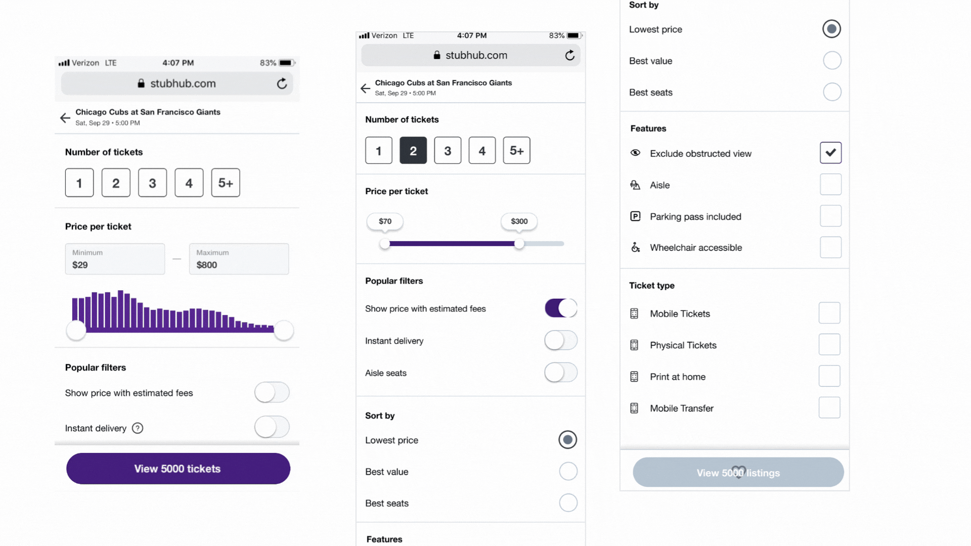
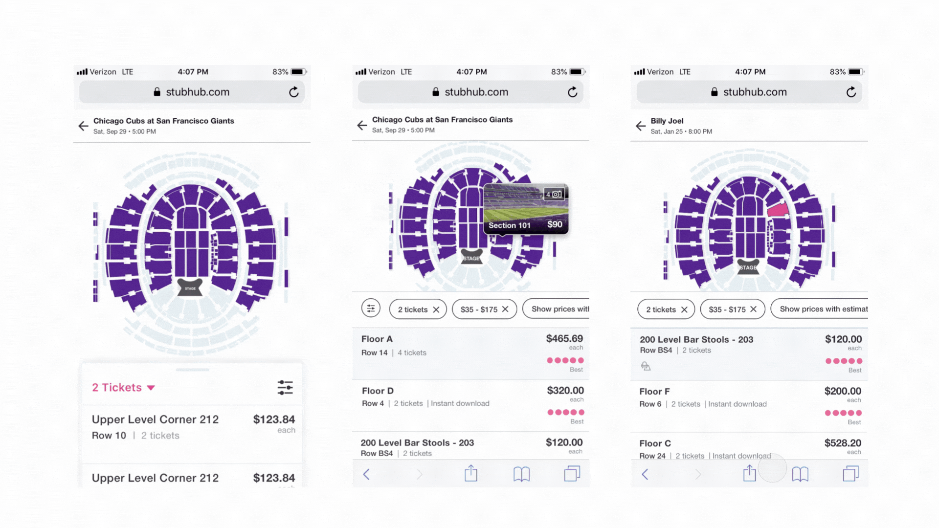
Simplified Layout
Stripped the interface down to three things: seat location, total price, key value indicators. Nothing else. If it didn't help someone decide, it didn't belong on screen.
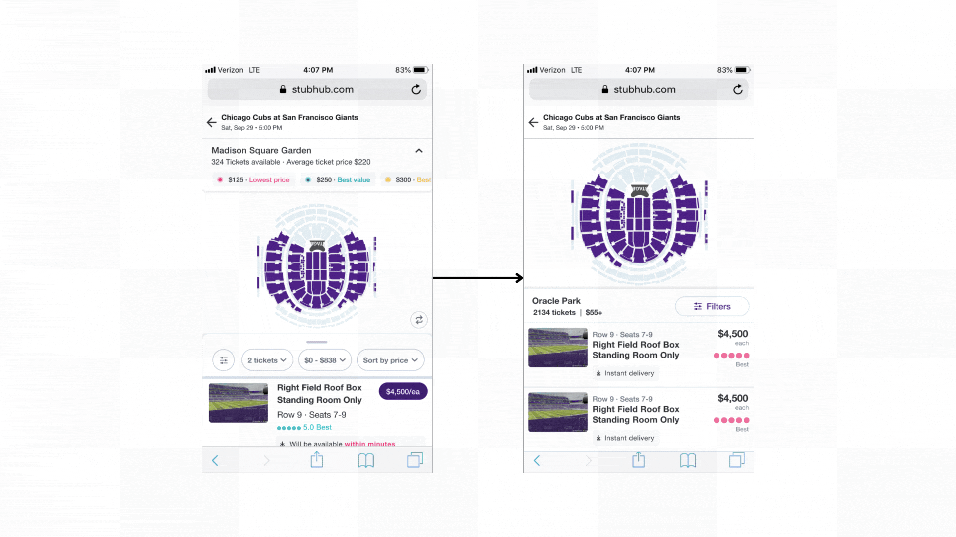
Contextual Highlighting
Users didn't know where "Section 114, Row C" was relative to the stage. We added spatial highlighting so the map and the listing spoke the same language. Hard to build — StubHub's map data is complex — but engineering got it done. It shipped and became the foundation for how the seatmap handled location context going forward.
What it took to ship
Inherited a failed framework. Realigned conflicting stakeholders. Tight deadline on a high-visibility surface.
Impact on the business
+5%
Conversion rate
(goal was do no harm)
2.2%
GMS lift
(on a $15M/day surface)